The Challenge
IDEMIA, an identity technology company, provides connectivity, payment, and public security solutions to companies and government organizations around the world. Its clients’ developers access highly technical documentation on its developer site.
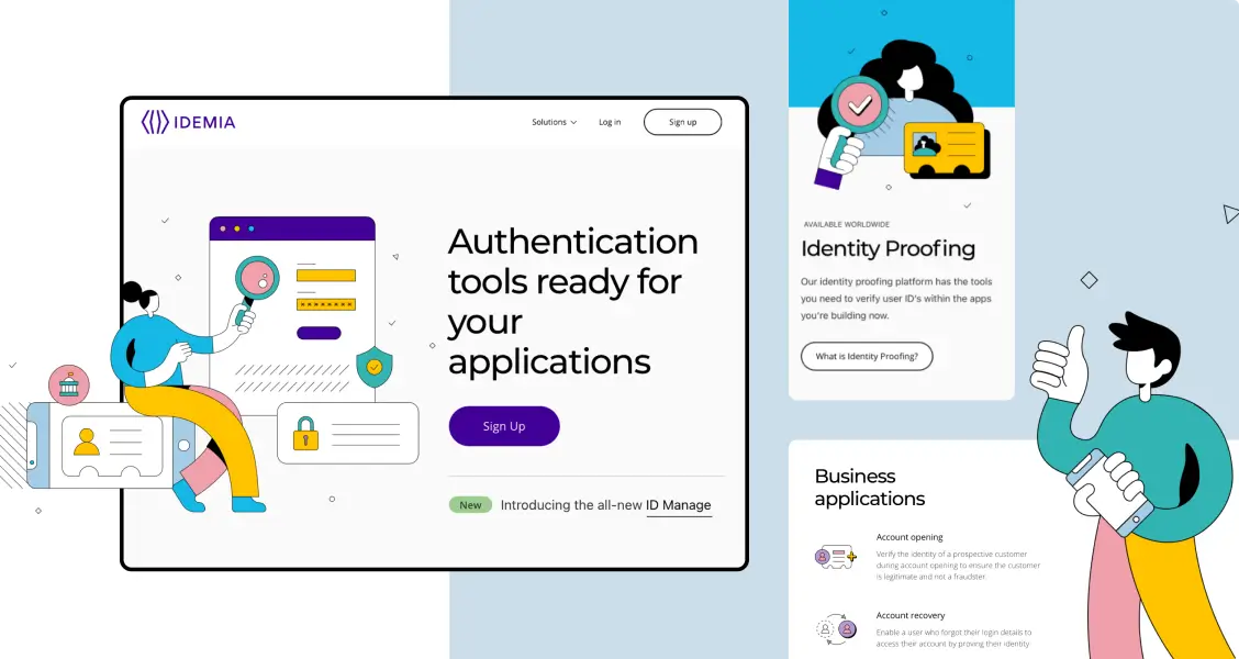
However, the developer site lacked a cohesive visual identity. Additionally, its non-intuitive UX design resulted in time-consuming user flows, making the site difficult to use for both business leaders considering IDEMIA’s solutions and the developers who need to access the documentation. IDEMIA came to us to develop a new visual identity and redesign all of its content to simplify the user experience for its customers, for both its public-facing and authenticated content.
Part 1: Discovery
Our team kicked off the work with a competitive analysis, to understand what the competition was doing well or not so well, along with how we could help IDEMIA stand out. We met with the client team to gather requirements and learn more about how they use the site. We also gathered insights on how prospective clients and developers use the site, to ensure we could improve the experience for every audience.
We also conducted a content audit of the current site, to learn about the content that we were working with and inform the new site’s content strategy. To rewrite, restructure, and redesign content, we had to understand the content and the business. The amount and complexity of the content required heavy analysis on our side.
Part 2: Direction
After our research, we started putting together the building blocks for the site. Our team explored ways to restructure and simplify the navigation and site functionality. We created several concepts for the new visual identity, which we narrowed down and refined with IDEMIA.
Throughout the project, we shared in-progress work with the client team to iterate sooner and avoid rework. Our close collaboration allowed us to move quickly and ultimately save time.
Part 3: Design
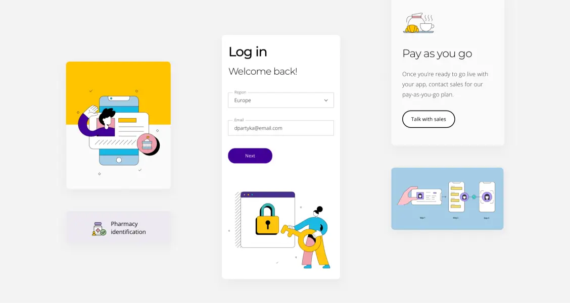
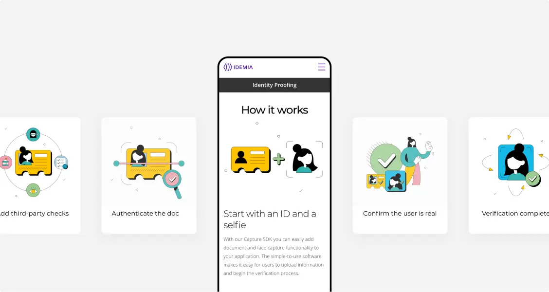
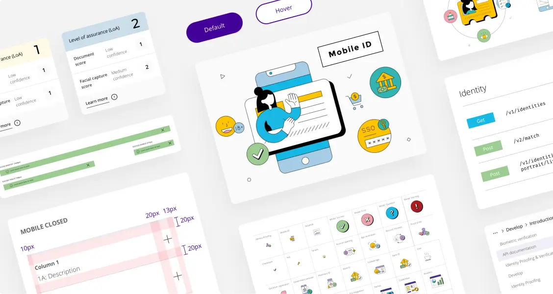
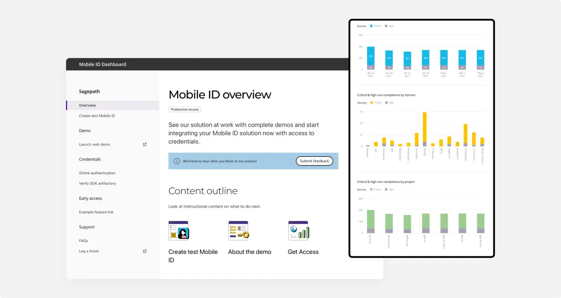
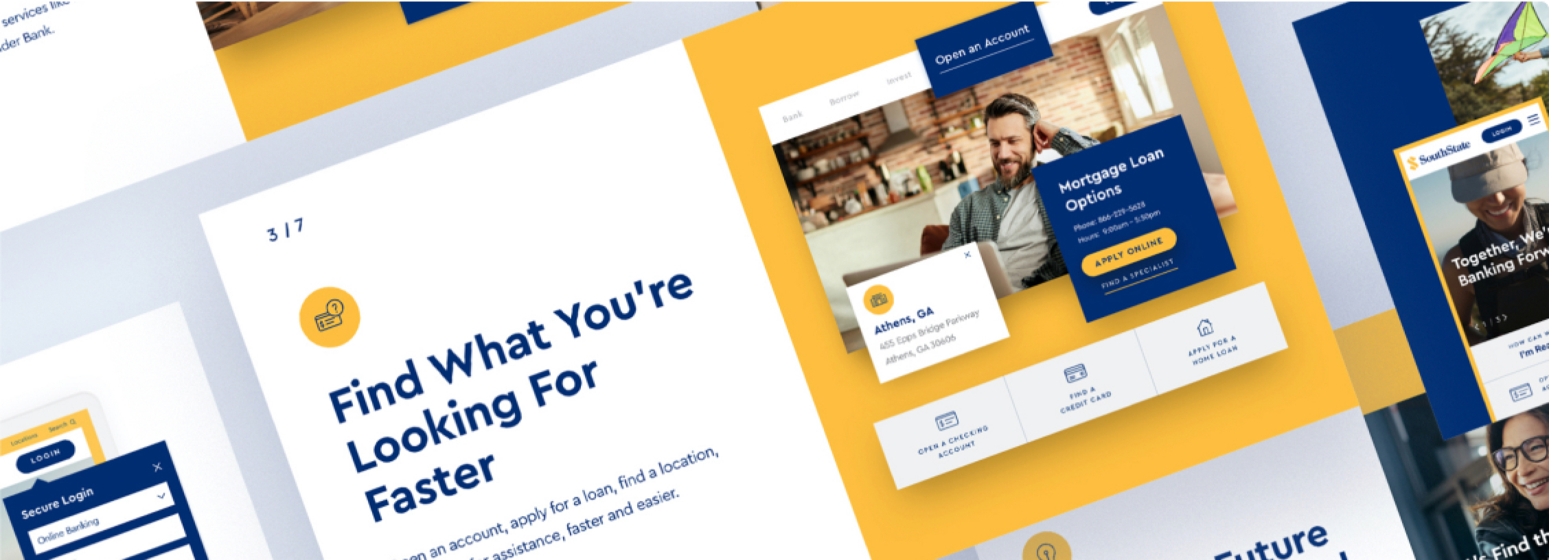
Following the concepting phase, we went to work on design. We created new brand guidelines, along with icons, illustrations, page templates, and infographics. Following a full design process, we provided wires, comps, copywriting, and prototypes. We also defined a new IA (information architecture) to help reduce unnecessary clicks and scrolling, saving end users time and frustration.
The Results
The updated design, content, and IA provided a cohesive visual identity for IDEMIA’s developer site and streamlined workflows for users. In addition to making content easier to find, we also simplified complex subject material for key decision-makers. The site is now responsive and scalable, and the team has its own brand guide to support continued growth.

Recognition
The project also won a 2022 W3 Award.
Silver for Creative Excellence
How can we transform your business?

Let’s Start a Conversation
Reach out to discuss your digital transformation needs and see how we can help. We would love to start a long-term partnership with your company.
Get in Touch